Color psychology in game design – how do colors help design better games?
- February 17, 2022
- Karolina Cieślak
There are a lot of elements to take care of when creating a game – mechanics, difficulty level, scenario, proper tutorial construction. The choice of the game’s dominant color palette does not seem to be crucial to all developers. Meanwhile, colors significantly impact the psyche of players. Read on for a journey through colors in game design from the perspective of psychological research.
The research conducted so far on game design shows, among other things, that using colors can:
- shape player behavior,
- control the player’s attention,
- give the player important feedback about their character and signal important cues about affordances or current state of the game world,
- convey various meanings of scenes, locations, and world elements,
- build a mood and evokes certain emotions to stimulate or to soothe the player,
- foster the automation of mental interface processing (e.g., some game HUD elements already have specific color assignments that players recognize instantly).
So how do you consciously and effectively use color in each of these game design spheres?
Shaping player behavior with colors
It has been scientifically proven that colors affect the human nervous system. Colors with longer wavelengths have a more stimulating effect (the longer the wavelength, the warmer the color). On the other hand, cold colors such as blue and white have a calming effect. Stimulation is influenced not only by individual colors but also by their combinations. Simply put, contrasting color combinations are stimulating, while gradients are calming.
From these seemingly simple properties, there are a number of effects of color on our behavior. So let’s take a look at some studies that show how appropriately chosen colors can shape player behavior
Red arouses the desire to compete
A psychological study published in 2008 found that in competitive-oriented computer games, players whose characters wore red won significantly more often than players wearing blue, which is most likely related to the competition-stimulating effects of red.
Yellow and red aid memorization
A 2015 experimental study found that colors affect our recall of objects and our confidence in remembering. This means that when we are faced with recalling what color an object was, it will be easier to remember that it was red or yellow, while it will be more difficult to remember that it was blue or green. Moreover, red and yellow increase our subjective confidence that we have remembered objects in those colors correctly.
Blue enhances creativity
Interestingly, even though blue and red are opposing colors, both colors support task performance;
red stimulates more effective performance on specific and detail-oriented tasks, while blue stimulates creative tasks.
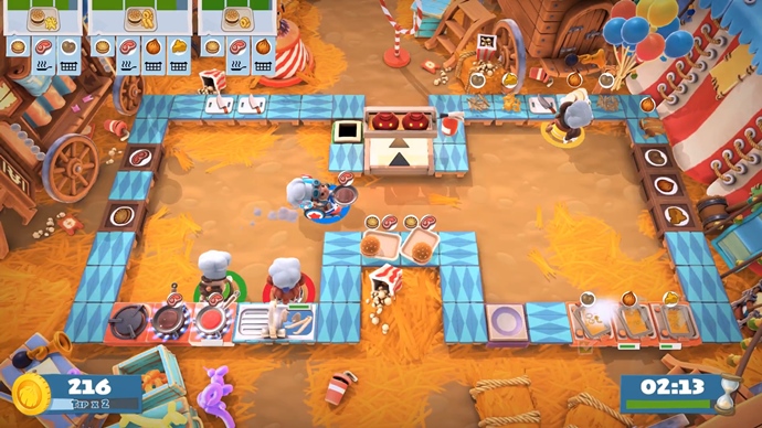
Red stimulates action more than other colors and signals that an action should be done immediately. Therefore, it is an excellent color for signaling danger and thus stimulating the player to seek a quick and concrete escape from this danger. This is why many titles use red as a signal that the player is running out of life points, such as Tomb Raider, where the screen turns red when Lara is low on health, so the player knows they need to take action.
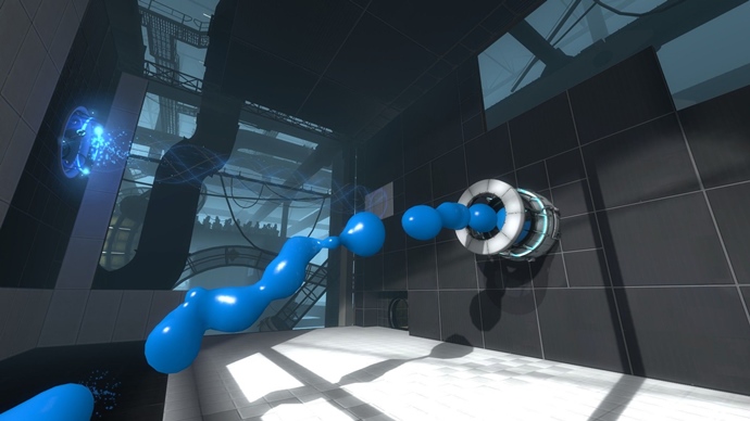
Blue, on the other hand, motivates players to perform tasks that require the use of intellect and creative tasks. It reinforces the desire to seek information, so in game design it can be used to convey relevant information to the player or get them to seek a creative solution.
For this reason, blue is perfect for puzzle game design.
Controlling the player’s attention
Color allows people to recognize objects more quickly, that is, at the sensory perception stage of the stimulus, and to remember them better, which makes a lot of sense in the evolutionary context. For example, color offered our ancestors valuable cues when seeking food: ripe fruit could be more easily seen from a distance. We can see color much faster than we can smell or taste.
Some colors catch the player’s eye more than others – colors with the longest light wavelength have a more stimulating effect and grab attention faster. Such colors are primarily red and yellow – and these are the colors that can be used most effectively to direct the player’s attention to a specific location.
It should be remembered that because red and yellow are the most stimulating, they are primarily associated with feelings and phenomena that cause us to have an accelerated heartbeat, shallow breathing or increased sweating – and therefore often symbolize danger.
Red and yellow are not only used in games to tell us to be on our guard – we associate these colors with danger or warning in other areas of life as well. Road signs are a practical application of this regularity. And precisely because we are taught from the beginning of our lives to pay attention to red and yellow, it is even more intuitive for us to direct our gaze precisely in the direction of these colors to be able to avoid possible danger.
So red and yellow can be used very effectively to draw the player’s attention to an item. A now iconic example of this is Mirror’s Edge, where red instantly points to objects that can be used for parkour. In this case, however, red does not communicate danger at all. Conversely, it indicates objects which can help the player. However, because the purpose of red objects is clarified in the game, the players are not afraid and understand there is no reason to avoid them. On the physiological level, on the other hand, we are still stimulated by red – and so our attention automatically focuses on red objects, making them easier to find and use.
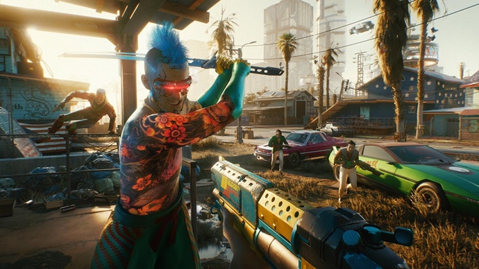
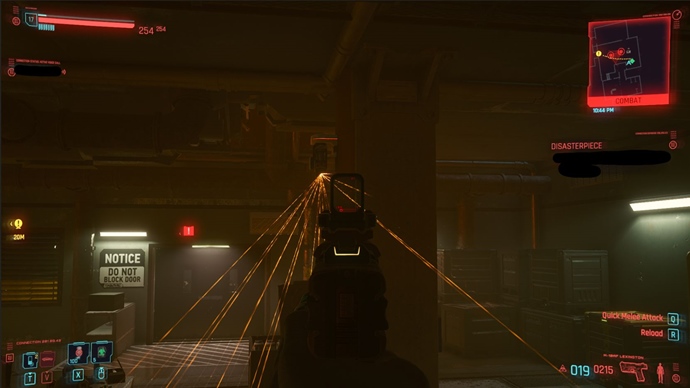
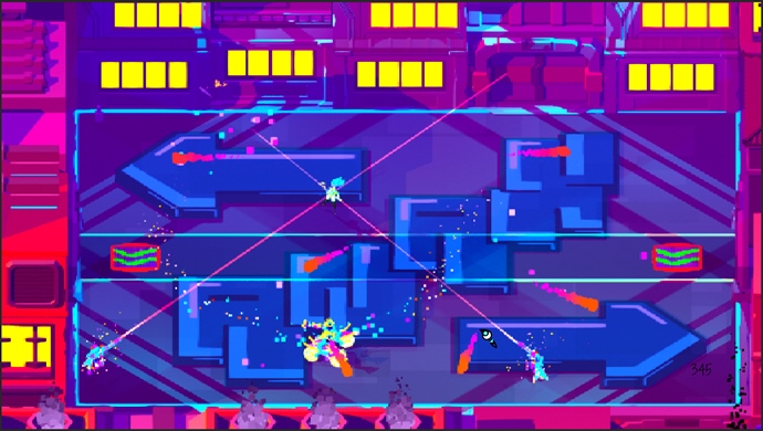
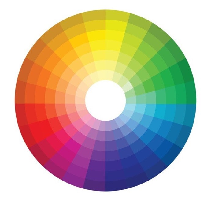
Contrasting colors, which lie opposite on the color wheel, can also guide the player’s attention. When such complementary colors appear together, they create a strong contrast, thus attracting attention (as I mentioned earlier: contrast stimulates). Using this type of diagram is good when you want the player to pay attention to a specific element. It is also a way to show dichotomies, opposites. A production that makes perfect use of this palette is Cyberpunk 2077.
Providing feedback
The colors allow the player to provide feedback related to their actions, such as letting them know if they did something right or wrong, if their character is running out of lives, or if they were successful in activating an object.
Of course, it would be possible to convey all this information to the player in other ways, such as through text messages, but
the use of color is much simpler and more effective because humans learn about the world much faster through color than other features of objects.
Because we want the player to understand the feedback promptly, it is a good idea to use color combinations that the player knows, either from other games or from real life. Using intuitive and natural color combinations, the player will have an overall sense of consistency and meaningfulness.
By not having to learn to interpret the cues all over again, the player will process the information faster and easier, resulting in faster engagement and lower abandonment rates.
So let’s move on to specific examples.
Red light – you are doing something wrong
Red is used to signal that the player has done something wrong, and green signals that they have done something right. This connection between colors and feedback seems very obvious. People are familiar with these colors (schoolchildren know that a red cross indicates a mistake) and how they affect our nervous system.
As I mentioned earlier, red stimulates players and signals danger. Although making a mistake while performing a task doesn’t necessarily carry any danger, the color red still tells us “something is wrong, look out”.
Green, on the other hand, is associated with nature and safety and, as a 2004 study showed, evokes positive emotions.
This is why so many games, e.g., puzzle games, use this scheme to provide feedback on the correctness of a task – making it even more intuitive and obvious to the player – because they already know it from other productions.
Yellow – be careful, you may have a problem
Yellow is also a color that works very well for giving feedback.
It’s a color that we notice quickly (just like red) and associate quite intuitively with warnings. Yellow alerts us to traffic lights, degrees of danger, or even when our phone battery is running low. In games, it can also successfully perform such a function – to give a sign of danger. The developers of Metal Gear Solid, for example, knew this, where the cameras would turn yellow when the player was being searched. Another example is Wildlife Park, a game about building a zoo and taking care of animals, where a yellow icon appeared over an animal that was not feeling well.
Making meaning
Over the years, games (and culture in general) have gotten us used to the idea that specific colors have specific meanings. For example, the life bar has a default color of red (because it is associated with blood, and good blood circulation is associated with body health) while mana is blue. Blue is rarely found in nature, which explains it’s often seen in games as a symbol of magic, of the extraordinary.
In mass culture, and especially in games, purple symbolizes mystery, fantasy and the uncanny. Dark purple is also the color of priests, spiritual enlightenment and arrogance and cruelty (e.g., Moebius – Legacy of Kain series). It is also very often a symbol of witchcraft, dangerous magic, and death. In video games like Dragon Age, Divinity: Original Sin, Heroes of Might & Magic, Diablo, Baldur’s Gate or The Elder Scrolls, it has become established that purple is a symbol of necromancy.
In pop culture, black has come to symbolize power, luxury, and elegance, but it can also mean professionalism, neutrality, and simplicity. And because it’s a very ‘serious’ color, it can also be associated with distance or even death and sadness. So in game design, it works well for “gloomy locations” and for characters that are supposed to be associated with power and elegance.

White is a symbol of purity and innocence. It is also associated with a new beginning, harmony, honesty, and impartiality. Like black, it is a symbol of minimalism and simplicity. It sometimes brings to mind divinity, transcendence and goodness. It is the most neutral color of all.
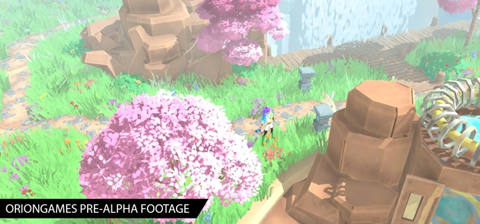
Turning color into a game mechanic
A very interesting example of a game using colors is Arto, an upcoming game from Orion Games. The game uses color as one of its key mechanics. The main character, traversing the presented world, restores its colors and thus – brings it back to life. In combat, on the other hand, characters who lose health also lose color.
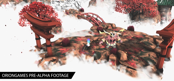
The use of colors as the main mechanic and axis for the narrative in this hack’n’slash game was, according to the players, something new and unprecedented, which made them perceive this aspect of the gameplay very positively and could undoubtedly constitute a unique value proposition of the title (Unique Selling Point).
In addition to the narrative and combat, painting the world also has an exploratory impact. For example, on one of the game’s extensive maps, colored sections indicate which areas have already been explored and which have not, which is a non-invasive and indirect way to help players search for items and new locations. What’s more, the motif of coloring the map aroused in players their inner Achiever (see our text about types of players). Finally, filling the map with color was so enjoyable for some players that achieving the goal could be a reward in itself. In our opinion, the development of this original production is worth following.
Mood building and emotional impact
The proper use of color significantly impacts the player’s emotions and the atmosphere of the game sequence.
The influence of different colors on mood
A 2004 study showed a very interesting correlation between green and emotions. Ninety-eight participants described their emotions when looking at different colors, both primary and secondary.
It turned out that green evoked both the most positive and the most negative emotions.
Juicy green evoked the most positive emotions of the other colors, while yellowish-green evoked the most negative emotions.
It is easy to explain this phenomenon – juicy green is associated with nature and safety. It works very well in the game Okami, where the player saves the world and dispels its darkness, making it alive, teeming with bright green. On the other hand, yellowish or brownish green bring to mind rottenness and toxicity – so they are strongly aversive colors.
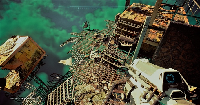
In Forever Skies, the upcoming game from Far From Home which we had the opportunity to explore, a dust cloud hovers over the Earth of the future. Its specific green color is supposed to evoke toxicity. This works well with the story, as an ecological disaster destroyed Earth before the protagonist arrived on it. The putrid toxic green is supposed to evoke uncertainty as to what lies beneath the dust, and on the other hand, is a reflection on human actions that led the planet to this state.
The color that is the most soothing is blue. Because it is a very short wavelength color, it has no stimulating effect.
For this reason, blue is good for making the player feel relaxed.

Red is the color of energy, love, desire. Physical strength, courage and excitement, but also anger, aggression and danger. Therefore, it has a stimulating effect on the player – it causes accelerated breathing, faster heartbeat and a stronger desire to act.
Red can be used very effectively to create an atmosphere of danger.
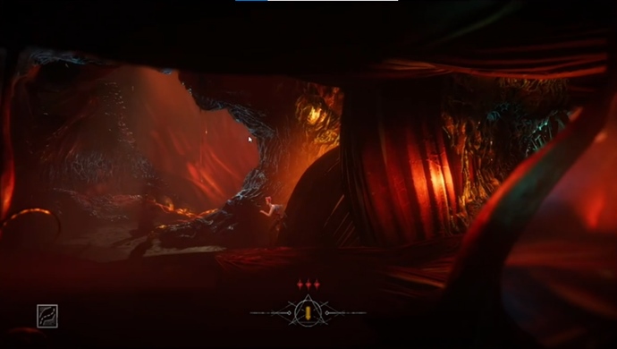
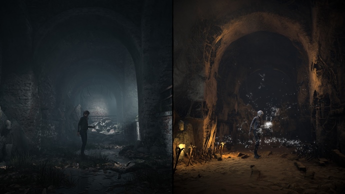
For this reason, it’s often used in the design of locations that are meant to evoke hell, such as in The Last Case of Benedict Fox, a platform game we researched in our lab
Studies show that orange and yellow intensify the feeling of hunger (as opposed to blue, which reduces it). Therefore, these colors work well, in games about cooking.
The influence of color combinations on emotions and mood
Monochromatism – enhancing a particular mood
A monochromatic palette consists of different shades of the same color. The main use of monochromatism is to create a point of focus and make the chosen aspect clearer.
It provides greater visual consistency and support for communicating specific objectives. In addition, the monochromatic scheme strongly reinforces the message.
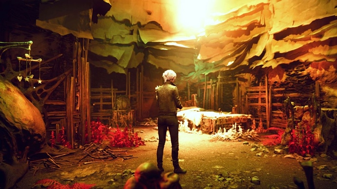
Let’s show this with the example of Succubus, a Polish production set in hellish lands. Thanks to the use of a monochromatic color palette focused mainly on red, the game’s atmosphere is very “concrete”. It is unequivocally associated with danger and sexuality – which is further enhanced by the fact that red is strongly arousing.

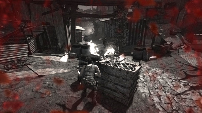
Achromatism – minimalism and… sadness and anxiety
The achromatic color palette consists exclusively of black, white, and shades of grey. It may seem like a boring palette, but
it works very well if you want to achieve a simple and minimalistic effect.
If we use darker shades, we can achieve an atmosphere of anxiety or sadness.
According to Emilio Padulo, a designer at Ubisoft, when using an achromatic palette it’s important to remember one important rule – the most important elements, such as the playable character or important objects, should be darker, while backgrounds and less important elements should be lighter.
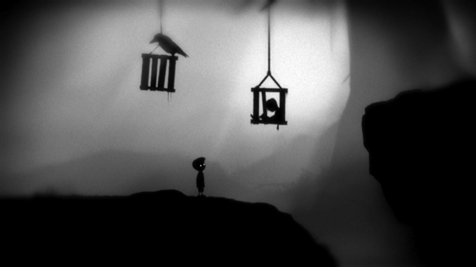
An excellent example of a game that uses achromatism is Limbo. The protagonist and the objects he can interact with are very dark, while the background is clearly lighter.
Analogous colors – a way to create harmony
Analogous colors are those lying next to each other on the color palette. Usually, one color is dominant, with complementary colors lying next to it, to the right and left. This color scheme is most often found in nature, and so helps to create harmony (e.g. a sunset).
A game that uses such a palette is the one we’ve mentioned above: The Last Case of Benedict Fox. Thanks to the skillful use of colors, the overall graphics hit a balance that is pleasing to the eye while still allows the game to emphasize the important elements.
Triad – seemingly disrupted harmony
The triad colors are those that form a triangle on the color wheel – equilateral or isosceles. This is a great scheme for creating vivid scenes if you want to maintain harmony, which is difficult to achieve with contrasting colors.
This scheme highlights important elements but does not symbolise opposites like opposite colors do.
Remember that if you want to maintain harmony, one of the colors must be dominant and the other two should be additive.
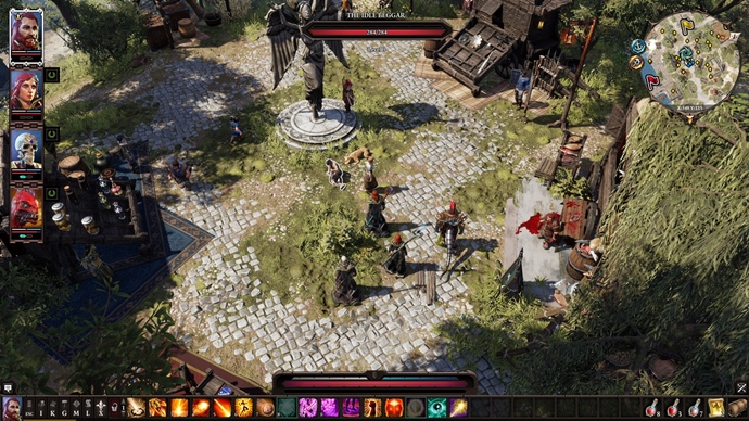
In The Medium – a game we did research for – the combination of red, yellow, and green is an example of a palette based on an isosceles triangle. Here, yellow is the dominant color. Other colors appear less frequently, which, despite its stimulating character, allows harmony to be maintained. Objects in additional colors: red and green are clearly striking and draw the player’s attention.
The Medium is, in fact, a title particularly noteworthy in terms of its use of color. This is because colors are a way of showing the difference between the real world and the spiritual world. As described above, we often see triadic colors in the spiritual, fantasy world, but monochromatism and achromatism are significantly more common in the real world.
Summary
The conscious use of color in game design is, above all, a very effective way to quickly engage the player in the production. Thanks to the use of colors for assigning meaning, when the developer follows the already familiar tropes (such as the blue color of mana, the red color of the health bar, or the yellow warning color), the player will more quickly understand the rules governing the game world. As a result, they will engage more quickly.
It’s the same with feedback – appropriately designed color feedback is intuitive and familiar from other productions. Consequently, the player assimilates them more easily and quickly.
Player behavior can also be modified or supported by the properties of individual colors – for example, the stimulating red, the creativity-enhancing effect of blue, or the calming effect of green. Colors and color palettes also affect emotions and moods and can, therefore, change a game scene’s tone.
It is worth thinking about colors in game design comprehensively and applying in practice the well-recognized knowledge from this area of gaming psychology.
_
Want to cite this article? Do it in an elegant way:
Cieślak, K., Zalewski, D., Żmuda-Adamskim M., (2022, 17 02). Color psychology in game design – how do colors help design better games?
https://tryevidence.com/blog/color-psychology-in-game-design-how-do-colors-help-design-better-games/
 (5.00)
 Our research team is supported by:


Karolina Cieślak
Video Game ResearcherPsychologist. In Try Evidence, her tasks are primarily related to the psychology of games - she researches, checks, and describes. She also writes texts for the web portals - gry-online.pl and grajmerki.pl. In games, she values non-linearity and unusual solutions.